UX/UI Design
Overview
Wizata is a Luxembourg-based Industry 4.0 SaaS platform that helps industrial companies optimize manufacturing processes through AI, anomaly detection, and digital twins.
When I joined the team, the product worked well technically but the interface was visually inconsistent, complex, and hard to navigate. The design lacked a system — components were built in isolation, the visual language was undefined, and the overall experience didn't reflect the sophistication of the technology behind it. For a platform where engineers and data scientists make high-stakes operational decisions, this wasn't just an aesthetic gap — it was a usability problem.

My role
UX/UI Designer — sole designer on the project.
I worked closely with the Product Manager to translate functional requirements and priorities into scalable interface solutions, while owning the overall UX and UI direction — including information architecture, interaction patterns, visual design, and the creation of the design system from scratch. I delivered implementation-ready designs and specifications to the frontend developer.
The problem
The existing interface was functional but visually fragmented and cognitively demanding. For engineers and data scientists working with complex industrial data, an unclear interface isn't just an aesthetic problem — it's an operational one. Users need to focus on the data, not on figuring out how to navigate the tool.
The product had no design system, no visual hierarchy, and no shared language to anchor decisions — which meant every component was built in isolation, and every inconsistency compounded the next.
User persona
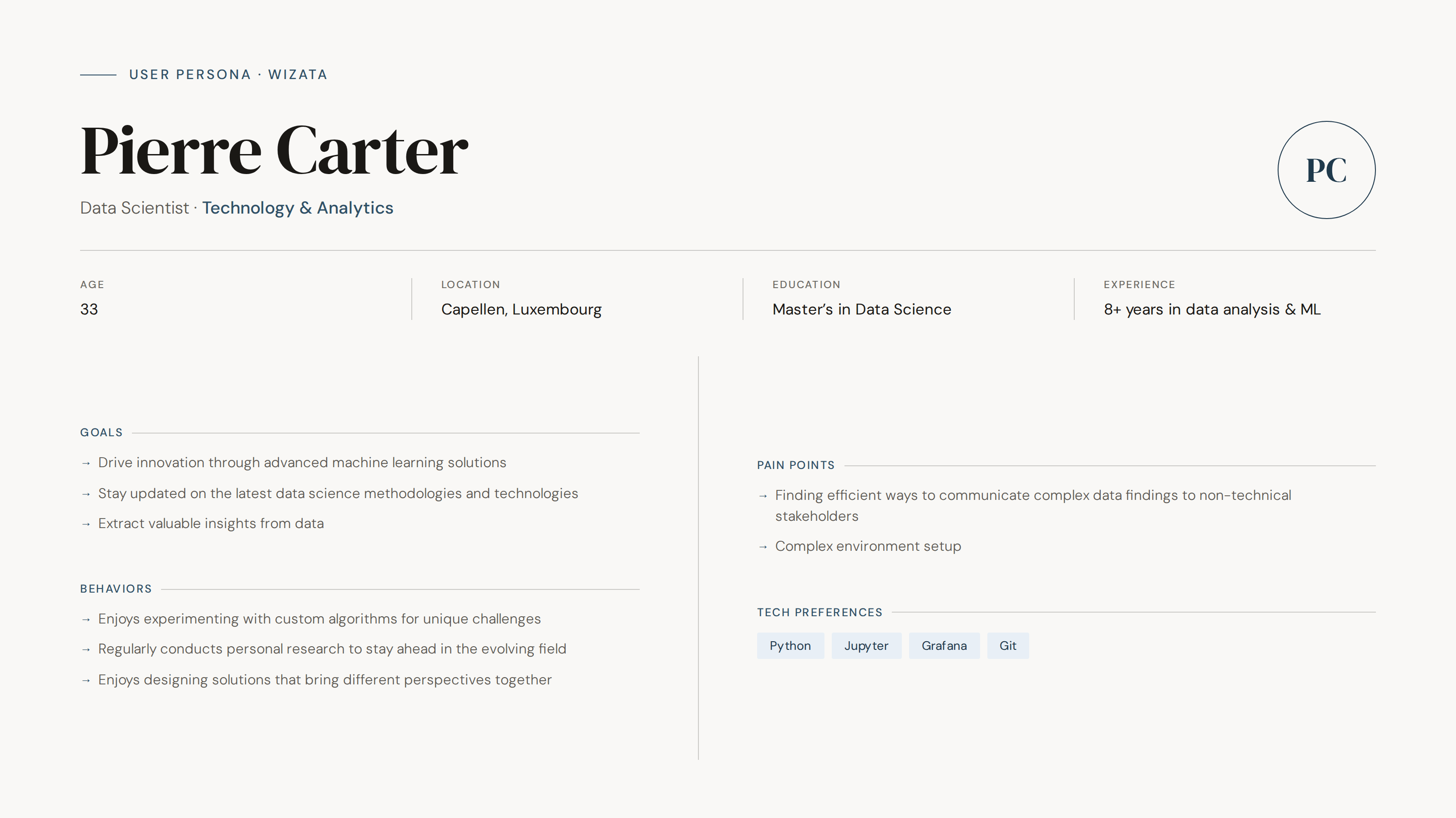
To guide design decisions, I created a lightweight user persona based on conversations with the Product Manager, business stakeholders, and my understanding of the platform's workflows and target users.
The primary user is a technically proficient professional — typically a Data Scientist or Process Engineer — working in an industrial environment under time pressure. They handle large volumes of operational data daily and need a tool that surfaces insights quickly, minimizes manual configuration, and integrates smoothly into existing workflows without adding friction.
Their main challenges include navigating complex systems, balancing experimentation with operational demands, and communicating findings to non-technical stakeholders.
This shaped every design decision that followed. A platform for expert users doesn't need to simplify the data — it needs to organize it.
Design System
The first time I opened the product, the immediate reaction was: I don't know where to look — because nothing was telling me what mattered. Every element competed for the same amount of attention.
That became the central design problem: the absence of hierarchy, and without a system, there was no consistent way to establish it.
The first constraint was clear: there was no existing system to build on, and no documentation of past decisions. Starting from scratch meant every pattern — color, spacing, typography, component behavior — needed to be defined, justified, and made reusable before a single screen could be redesigned consistently.
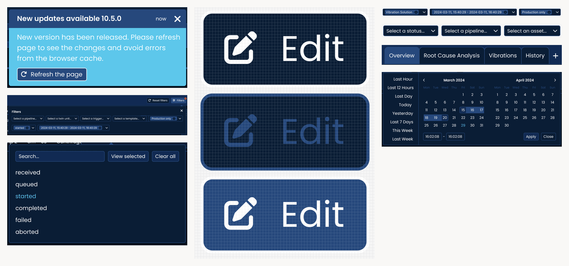
I proposed and defined a new color palette for the product interface, shifting to a dark mode-first approach with clear semantic logic: a strong orange as the primary action color, layered blues for backgrounds and components, and distinct colors for highlight, error, and success states.
The entire system was designed for dark mode as default: this wasn't a stylistic choice — it reflected the operational reality of users working in low-light or monitor-heavy industrial environments.
Component behavior and interaction states were documented in detail to reduce ambiguity during development and make frontend implementation more predictable.
The design system served a second purpose beyond visual consistency: it became the shared language between design and development — the artifact that made collaboration possible without constant back-and-forth.
UX/UI Design
Before redesigning any interface, I spent time understanding how the product worked and how users moved through it: where decisions were made, what information was needed at each step, and where the interface was creating unnecessary friction. This understanding shaped how I applied the design system — not as a visual layer added afterward, but as a structural intervention embedded into the product experience itself.
To inform design decisions, I referenced other data-intensive B2B platforms, benchmarked interaction patterns, and iterated early with the frontend developer to ensure the system could be implemented consistently across the product.
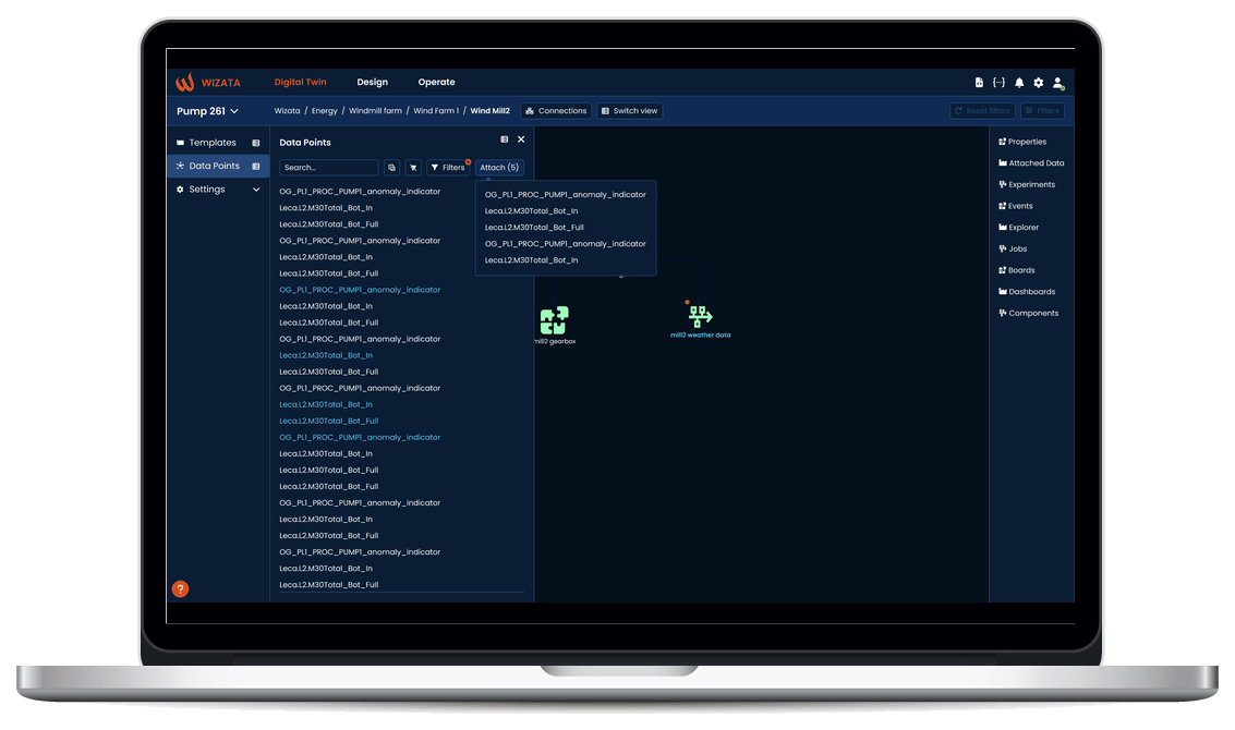
With the system as the foundation, I redesigned the platform around clarity, hierarchy, and workflow efficiency. Layouts were restructured so the most critical information commanded attention first, navigation was reorganized to reduce context switching, and data-heavy views were simplified by clearly separating configuration from output. Alert visibility was improved in areas where users needed to respond quickly, while spacing, grouping, and semantic color usage helped make dense interfaces easier to scan and interpret.
Each decision was made through the system, not around it — which is what made the final product feel coherent rather than simply visually consistent.
In parallel, I collaborated with the Product Manager on new feature design, translating functional requirements into interaction flows and delivering implementation-ready specifications for the frontend developer.
Outcomes
The design system was fully adopted by the frontend team and implemented across the entire product. The visual and structural consistency it introduced made the interface significantly more intuitive — reducing the cognitive load for users working with complex, high-stakes data daily.
For the first time, the product team had a shared design language: a common foundation that made future feature development faster, more predictable, and easier to communicate across design and engineering.
It reduced implementation ambiguity, accelerated feature delivery, and established a scalable visual foundation for future product growth.
Reflections
This project taught me what it means to own design decisions completely. Without a senior designer to validate my choices, I had to develop strong conviction about every decision — from color ratios to spacing systems — and communicate that reasoning clearly to a PM and a developer who were focused on functionality, not aesthetics.
Working without an existing system meant every pattern I defined became precedent. That's a different kind of responsibility than iterating on something that already exists.
The most satisfying part was seeing the frontend developer implement the system and watching the product transform. When a design system works, you stop noticing it — and that's exactly the point.