UX Research · UX/UI Design
Overview
Transbank is Chile's leading electronic payment processing company. Webpay PatPass is its recurring payments solution, enabling automatic credit card charges for public and private services.
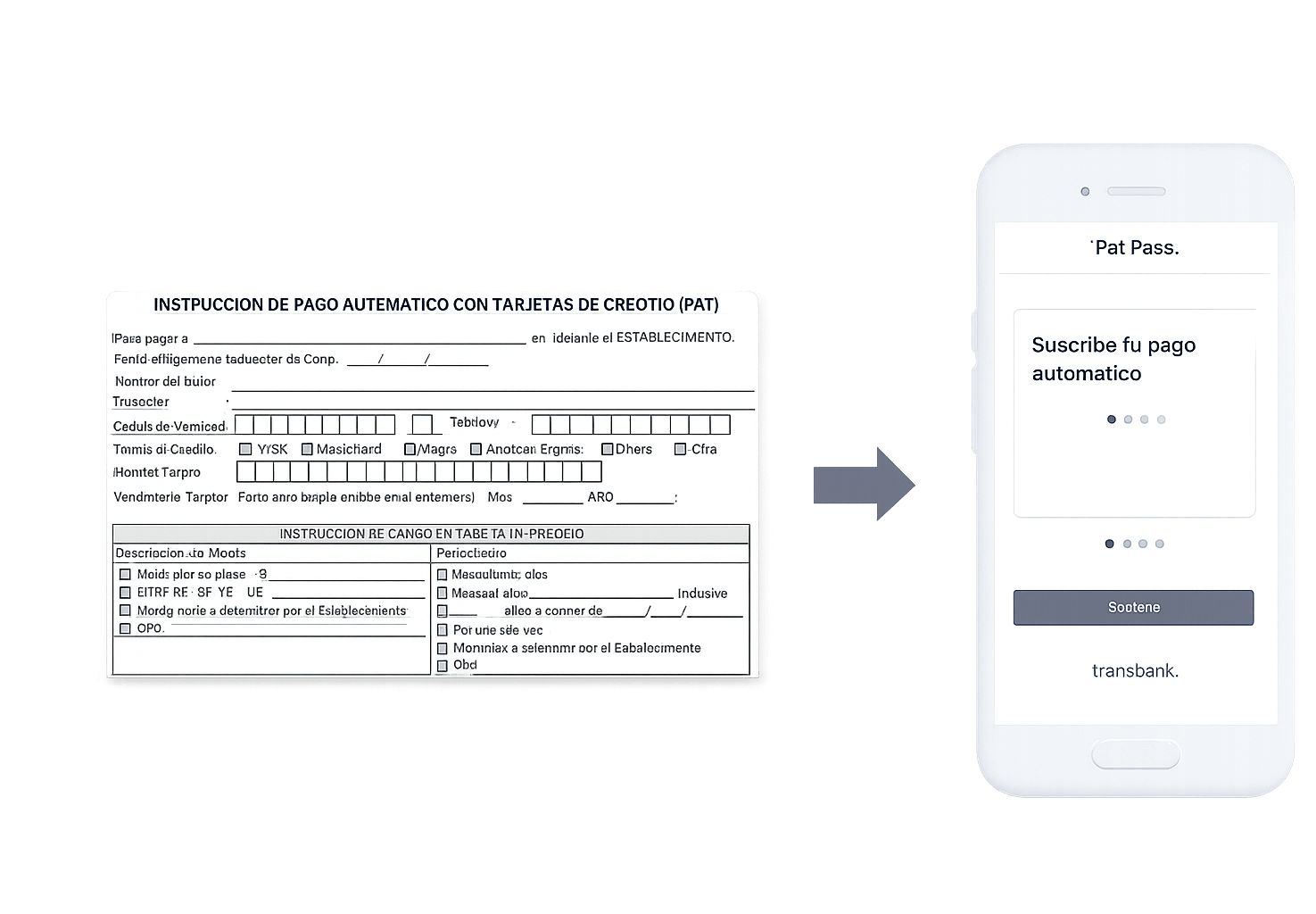
When I joined the team, subscriptions still happened on paper. A street promoter would meet a user in person, hand them a physical form, and collect their credit card details by hand — a process that felt out of place for a fintech company at Transbank's scale. The goal was to replace that with something users could trust and control themselves: a secure digital subscription flow they could complete from their own phone.
My role
UX/UI Designer embedded in the Webpay PatPass product team.
My path at Transbank started as a UI Designer, working in parallel as Focal UI Designer across the company's corporate digital products. By the time this project happened, I had moved into a UX Designer role — which is the capacity I worked in here, alongside a dedicated UX Researcher. She led the formal research process, and I was closely involved throughout, from journey maps and personas to the wireframes and final interface design.
The problem
The existing flow had a simple but serious flaw: sensitive financial data was changing hands on paper, in public, between strangers. It wasn't just insecure — it was slow, and it gave businesses no visibility into what was happening with their own subscription funnel.
Beyond the friction for users, this also meant real business cost: low conversion, manual overhead, and no way for businesses to see where subscriptions were breaking down.
Methodology
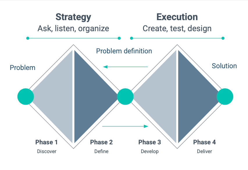
We followed a Double Diamond framework across four phases — Discover, Define, Develop, Deliver — and moved through it deliberately. In a project with this many stakeholders and this much sensitive data on the line, having a shared, structured process wasn't overhead — it was what let research, design, and the business side stay aligned at every step.
Discover & Define
Focused on understanding the problem from both sides: the businesses using PatPass and the users subscribing through it. This phase included stakeholder interviews, user interviews, journey mapping, persona creation, and hypothesis definition.
Develop & Deliver
Focused on designing and validating the solution. This phase included ideation, wireframing, low-fidelity testing, iteration, and the final UI delivery for mobile and desktop.
Research
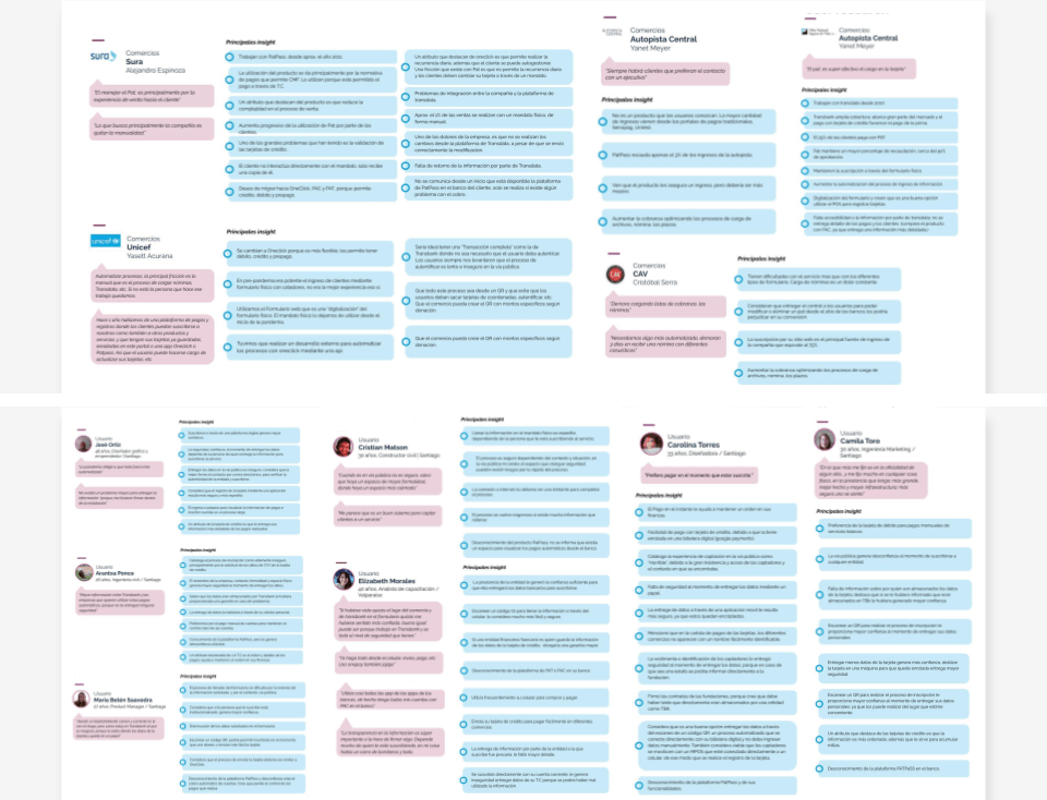
We split the research in two: businesses using PatPass, and the people subscribing through it.
Talking to five companies across different industries surfaced something almost contradictory: the paper form was their best conversion tool and their worst operational headache at the same time. Several had already tried to patch around it with their own integrations — a workaround that told us the problem was urgent enough to solve informally, even before we got involved.
On the user side, across six interviews, one thing came up over and over: nobody was comfortable handing a stranger their credit card in public. That discomfort, more than convenience, was what made people open to a digital alternative — especially one they could complete from their own phone via QR.
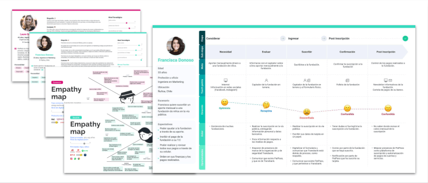
Empathy maps, journey maps for both sides, and validated personas came out of this work — and they're what kept the design conversations grounded in what people had actually told us, not what seemed reasonable on paper.
The solution
The answer was a QR-triggered, mobile-first form that took the entire paper process and put it in the user's hands: scan a code, complete four steps on your own device, get confirmation immediately.
Design
The physical subscription form was the starting point — and also the biggest constraint. It carried a lot of fields, some necessary, some there out of habit rather than function. A big part of the design work was editorial before it was visual: figuring out what actually needed to survive the jump from paper to screen, and cutting everything else.
Once we'd stripped it down, the real challenge became sequencing — turning what was left into a flow simple enough to complete on a phone, without losing anything that mattered financially or legally.
The four-step flow
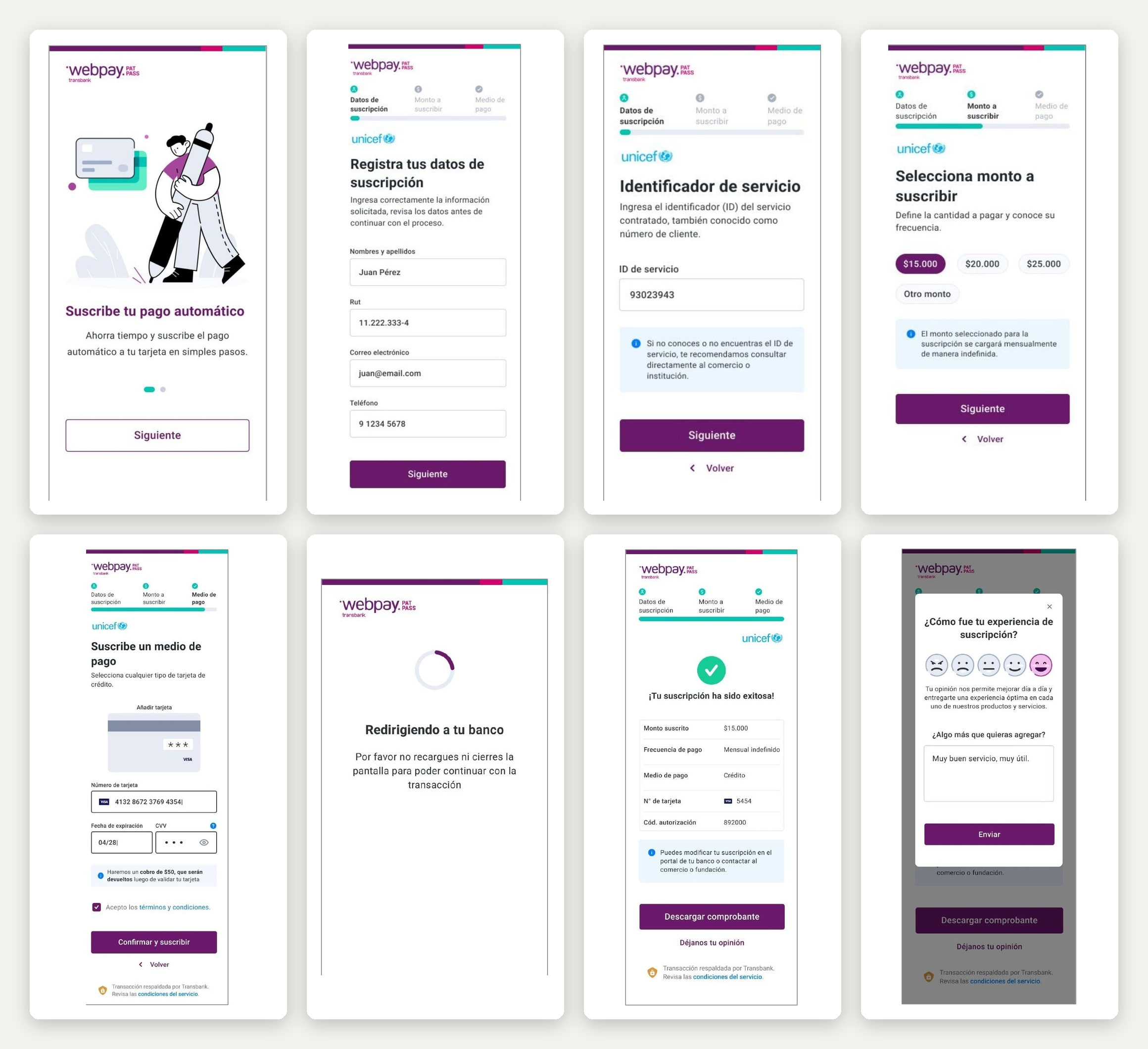
The form became four steps, each doing one job:
- Personal data entry
- Service ID validation
- Subscription amount selection
- Credit card data entry and bank authentication
A few decisions mattered more than they might look: a progress indicator to keep people oriented, real-time validation to catch mistakes before they became a submitted error, upfront honesty about the $50 verification charge, and a voucher at the end that gave people something tangible to hold onto after a process that used to end with a signature on paper.
User flow
The complete subscription flow covered five key stages, each designed to minimize friction and maximize clarity for a user completing a sensitive financial transaction from their phone.
Onboarding
Accessed by scanning a QR code provided by the business. Initial screen introduces the service and sets expectations before the user begins.
Personal data entry
All fields are required. The business logo may or may not be displayed depending on the business's configuration.
Service ID entry
The entered ID is validated in real time against the database. If the identifier is not found, a clear error screen is displayed with instructions to contact the business directly.
Amount selection
Users select a subscription amount in Chilean pesos. UF-based amounts were planned for a future release.
Credit card entry and bank validation
Users must accept terms and conditions to proceed. A notice is displayed about the $50 verification charge, which is refunded after card validation. Users are then redirected to their bank to authenticate the subscription.
Subscription confirmed
A success screen displays full subscription details for 10 seconds. Users can download their subscription voucher and optionally leave feedback.
User interface
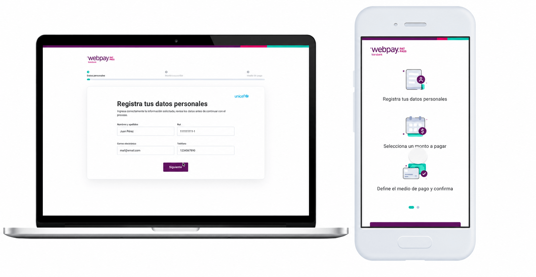
The final interface was designed for both mobile and desktop, adapting to different business contexts while maintaining a consistent and trustworthy visual experience aligned with the Webpay PatPass brand. In a flow that asks people to type in their credit card details, that visual trust isn't decoration — it's half the job. All screens were designed following Transbank's design system to ensure consistency with the broader product ecosystem.
Usability testing
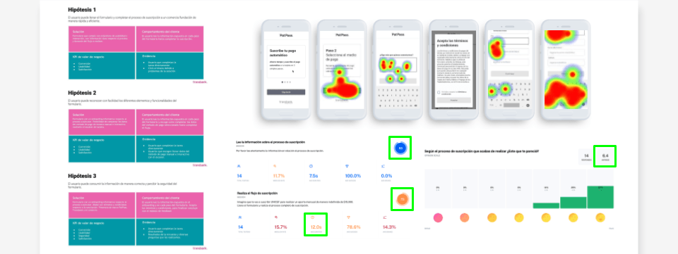
We tested three hypotheses with 14 participants, using moderated sessions with heatmap tracking — and the results were reassuring in some places and humbling in others.
Hypothesis 1 — Users can complete the subscription flow quickly and efficiently
100% task completion rate
Hypothesis 2 — Users can easily identify and interact with all form elements
93/100 usability score on the onboarding screen
Hypothesis 3 — Users feel the form is secure and their data is protected
Average satisfaction score: 6.4/10. Main friction point identified in the credit card entry step (12 seconds average completion time), which informed a subsequent design iteration.
Outcomes
The final product replaced a paper-based, in-person process with something users could complete securely on their own — faster, and entirely in their own hands. For businesses, it meant a new digital channel and, for the first time, real visibility into how their subscription flow was performing.
It also opened the door for what came next: additional payment methods and UF-based amounts were already being planned as natural extensions of the same flow.
Reflections
This project was one of my first end-to-end UX Research experiences within a large corporate environment. Working alongside a dedicated researcher taught me how to structure research rigorously while keeping design decisions moving in parallel.
Navigating Transbank's corporate environment — with its layers of stakeholders and approval processes — sharpened my ability to communicate design decisions clearly and confidently to people who think in business terms, not design terms.
The biggest challenge wasn't the design itself — it was the logistics of the research process. Coordinating interviews with multiple businesses and users, aligning schedules, gathering resources, and keeping everything organized across a large organization required a level of coordination I hadn't navigated at that scale before.