UX Research · UX/UI Design
Overview
HEAL Security is a cognitive cybersecurity intelligence platform built for the US healthcare sector. Its platform — made up of HEAL Security Desktop, Vitals, and Dispatch — consolidates threat intelligence, real-time updates, and curated news into a single, unified layer designed for cybersecurity professionals in healthcare organizations.

My role
UX/UI Designer — sole designer on the product team.
I owned the full design spectrum across this engagement: UX research, persona development, information architecture, UI design, brand identity, and design system. In practice, that meant moving fluidly between strategic and execution work.
I collaborated closely with the Product Manager and Business Analyst to shape new features from the ground up, translating business goals, technical constraints, and user needs into product direction and end-to-end experiences. I was also responsible for implementation quality: staying involved through handoff, QA, and iteration cycles, working directly with developers to close gaps between design intent and built output.
The problem
When I joined, the product team had two proto-personas created during HEAL Security's early stages. They were useful as starting hypotheses, but they weren't grounded in validated research — and in practice, they weren't doing the job a good persona should do. Feature discussions lacked a shared reference point, and decisions about what to build, and for whom, had no reliable anchor.
On the visual side, the product had a design system, but it was inconsistent in application and hadn't kept pace with the product's growth. The UI lacked coherence, the brand felt undefined, and the existing foundation wasn't structured to support the speed of development the team needed to maintain.
Both problems pointed to the same underlying need: before the product could grow with confidence, it needed stronger foundations — in research, in identity, and in systems.
Methodology
At this stage, HEAL Security was an early product without direct access to real users, which shaped how the research process was structured — and is reflected in the approach described below. The priority was to establish a scalable product foundation quickly, which meant UX and UI evolved in parallel through a highly iterative workflow.
Working within a small, fast-moving team also meant taking a proactive role in shaping the product. Alongside Product Management initiatives, I frequently identified problems, proposed directions, and initiated design improvements independently as new product needs emerged.
Research
The two existing proto-personas described a Cybersecurity Analyst and a CIO. A reasonable starting point — but not enough to provide a single, coherent design target.
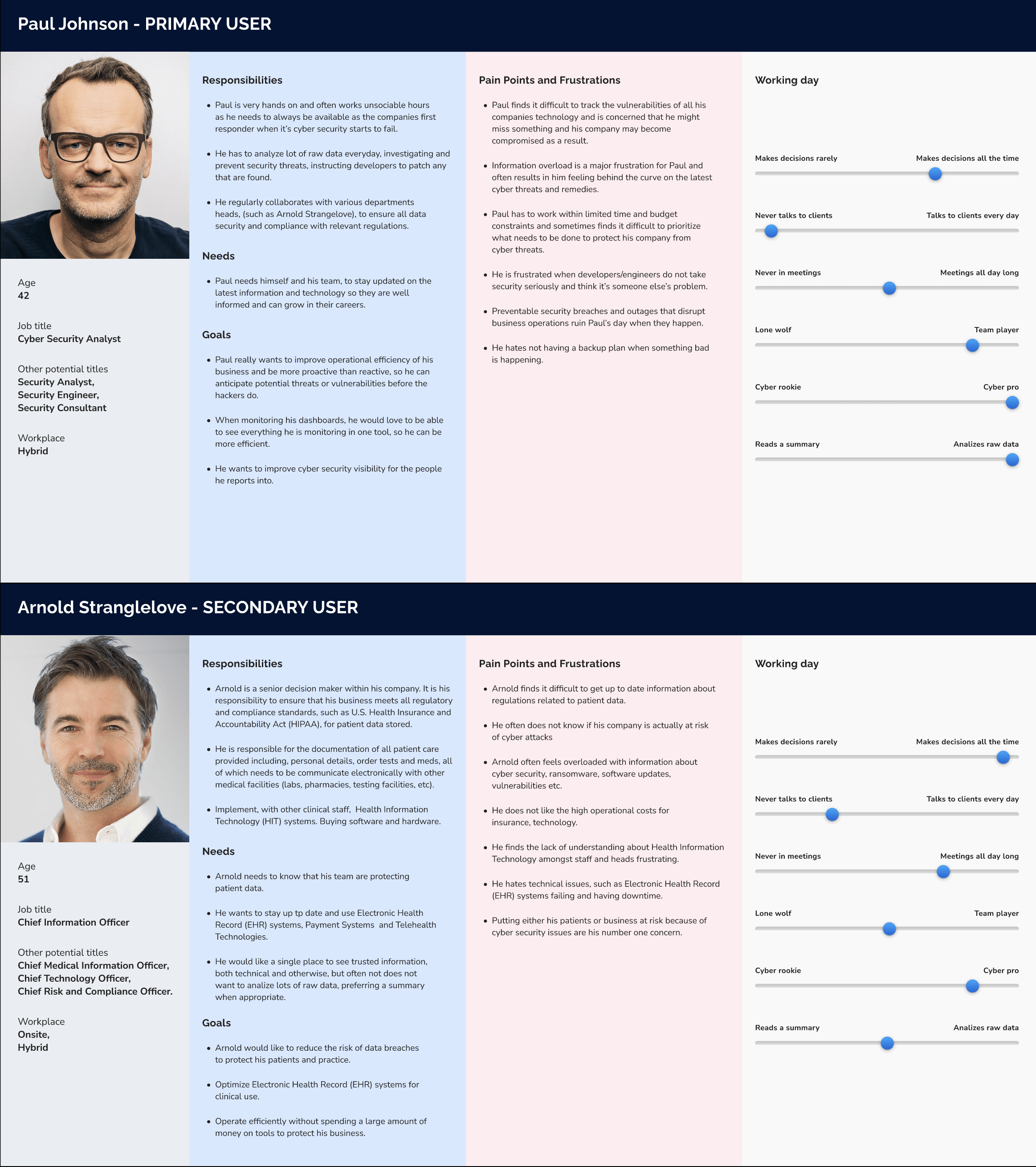
The question driving the research was precise: who is the user HEAL Security actually wants to design for? Not a job title, but a person — with a daily reality, a set of pressures, and a specific relationship to the kind of tool HEAL Security was becoming.
To move beyond the proto-personas, I built a hypothetical empathy map to challenge assumptions and surface what we knew, what we were guessing, and what we didn't know at all. Rather than mapping each persona separately, I used the empathy map to look at both profiles together, asking what a person who had lived through both roles would actually think, feel, see, and do. The process was iterative and involved ongoing debate with the PM and BA — their business perspective kept the research grounded in what the product needed to be, not just what users might say they wanted.
As the mapping evolved, a pattern emerged: despite the differences in role and responsibility, both profiles were oriented toward the same fundamental need — a single, reliable tool that reduced cognitive load and helped them stay ahead of threats rather than constantly catching up. The gap between analyst and executive, in this context, was smaller than it first appeared.
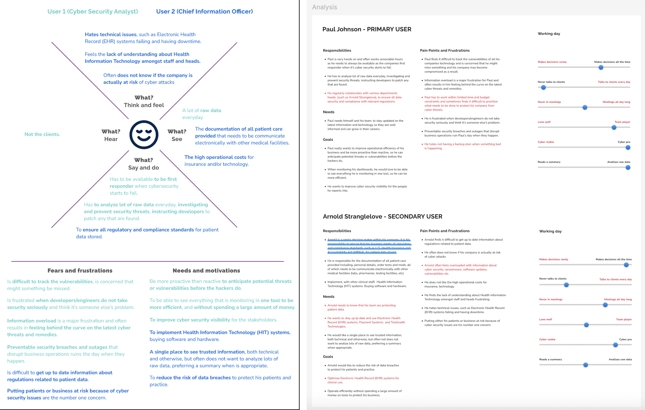
That overlap led to the most consequential decision of the process: consolidating both profiles into a single combined persona — someone whose career had moved through both roles. It was a recognition that the most valuable user for HEAL Security was the person who had seen both sides: the one who understood the operational reality of threat analysis and the strategic weight of security decisions at the executive level.
User persona
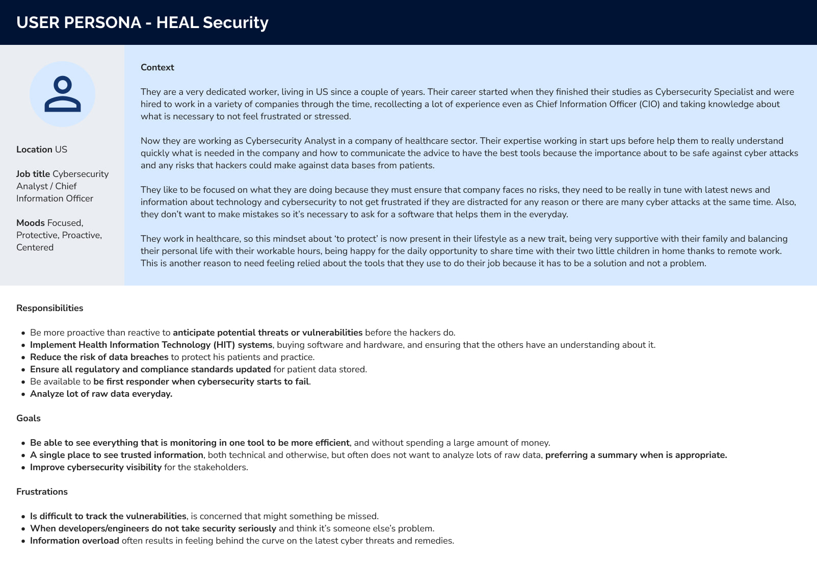
The resulting persona combined hands-on cybersecurity experience with executive-level perspective: a healthcare security professional who had worked across both analyst and leadership roles, and who understood what it meant to operate under pressure in an environment where security failures carry direct patient safety consequences.
This dual perspective became central to the product direction. The user needed a tool they could trust immediately — one that surfaced meaningful threats quickly, reduced the volume of noise they had to process, and transformed raw security data into clear, actionable intelligence. In healthcare, reliability and clarity aren't just usability goals. They're operational requirements.
The consolidated persona gave the team a more concrete decision-making framework than two disconnected role-based profiles ever could. It shifted conversations away from abstract user types and toward a specific person with real constraints and motivations — which directly influenced decisions around information architecture, dashboard prioritization, and the overall tone of the product experience.
Brand redesign
With a clearer picture of the user in place, I led a redesign of HEAL Security's visual identity. The work covered the logo system, color palette, typography, and overall visual language — aimed at a balance between technical precision and approachability that felt right for a healthcare cybersecurity audience: credible and serious, but not cold.
The updated brand identity was documented in a comprehensive brand guidelines file, providing the product and marketing teams with a consistent reference for all visual communication going forward. Beyond defining the system itself, I also worked closely with the teams to oversee and maintain accurate implementation across the product, website, and supporting materials — ensuring the new identity was applied consistently throughout the company.
Design System 2.0
With a clearer user understanding and a refreshed brand in place, I created Design System 2.0 — an updated component library and style guide built to support the product's next phase of growth.
The system covered core UI components, spacing and layout rules, color tokens, typography scales, and interaction states. The goal was to reduce design-to-development friction, accelerate iteration, and maintain visual consistency as the feature set expanded. Also, this enabled the team to move faster without sacrificing quality.
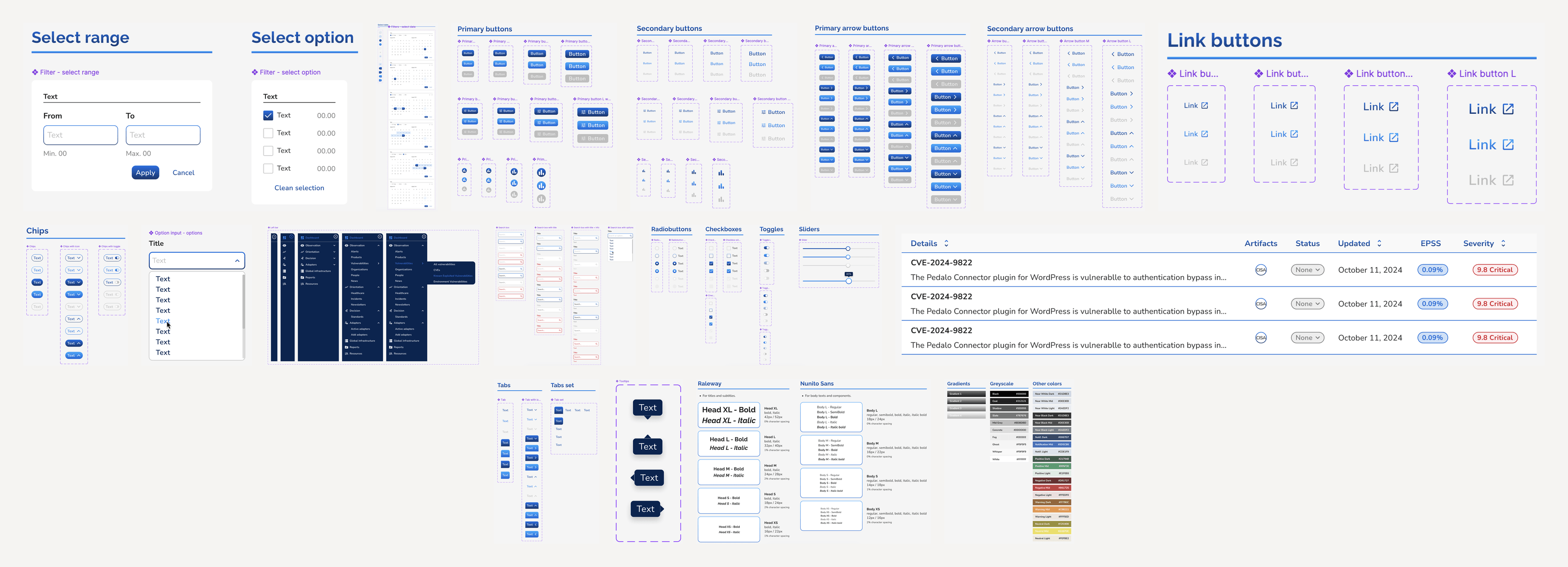
The light mode version was fully implemented and actively used by the development team. The dark mode variant was designed and documented, ready for the next development cycle.
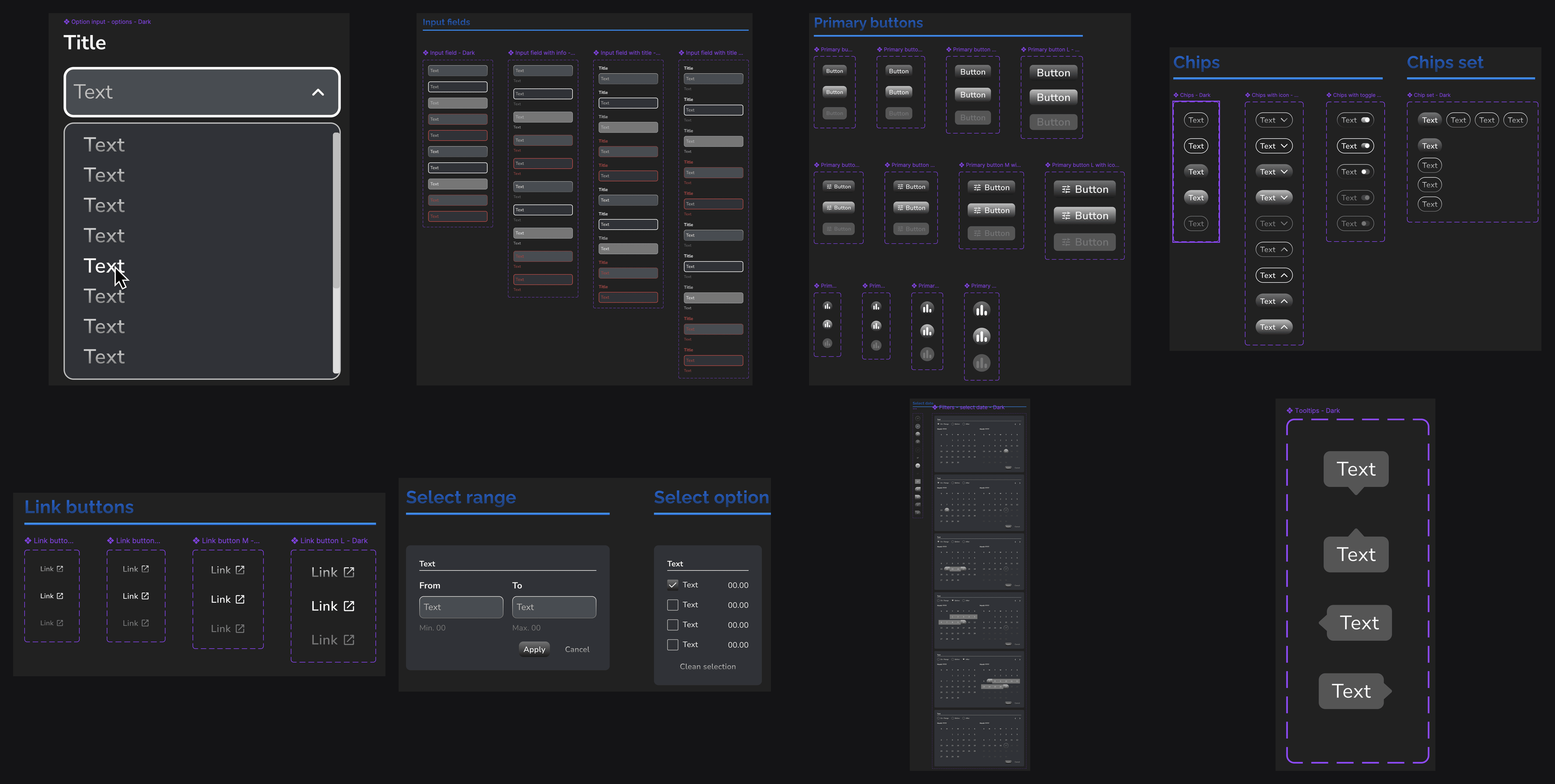
UX/UI Design
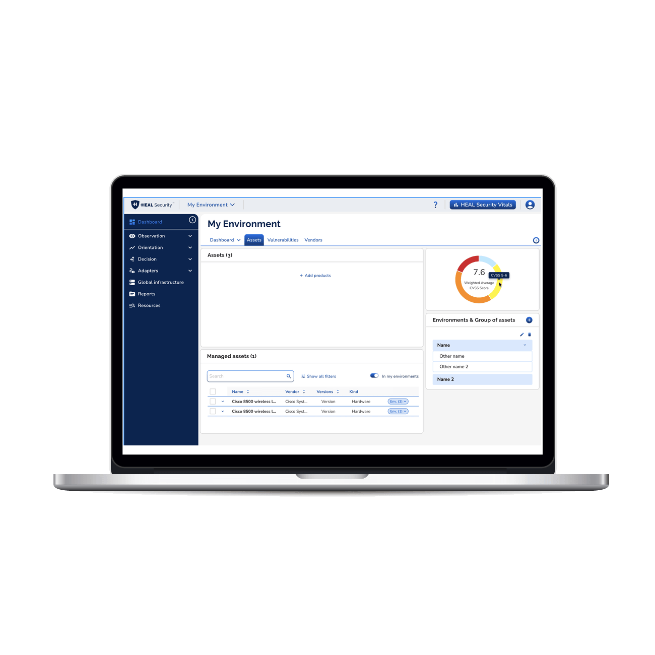
Alongside the foundational work, I redesigned and expanded large parts of the HEAL Security product ecosystem — including the web platform, navigation structure, feature architecture, and marketing site.
I restructured parts of the information architecture and sitemap, redesigned menus and navigation patterns, improved existing workflows, and designed entirely new product features from concept to implementation-ready UI. This included updates across dashboards, feature flows, internal tools, interaction patterns, and public-facing experiences.
Because the product was evolving rapidly, much of the design work happened continuously and in parallel with ongoing product development. Rather than treating UI as a final visual layer, the work focused on shaping a more cohesive product experience overall: improving usability and visual maturity across the platform.
Browser extension
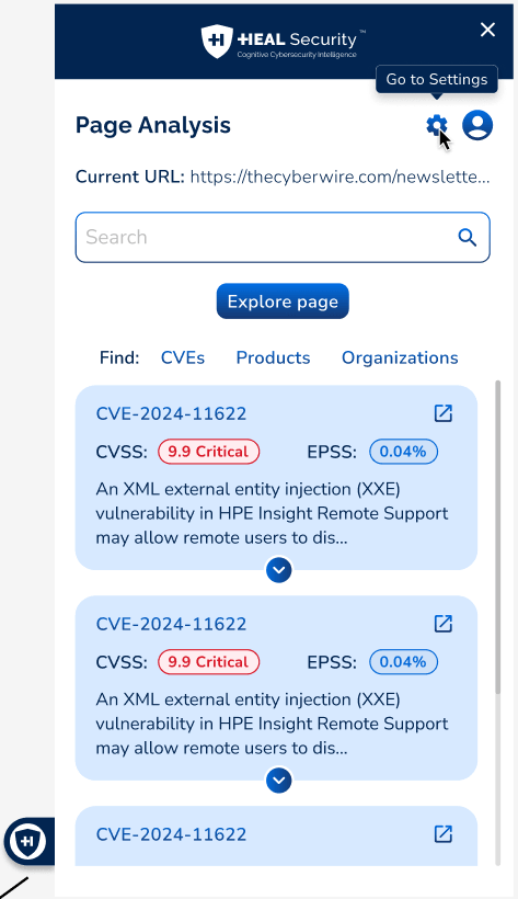
One of the more self-contained product initiatives I led was the design of a browser extension — a lightweight tool that detected cybersecurity-relevant news and information in real time as users browsed the web, surfacing it within the HEAL Security ecosystem.
The work began with a research phase alongside the PM and BA: mapping use cases, defining what "relevant" meant for a healthcare cybersecurity audience, and establishing the interaction model for something that needed to be useful without being intrusive. A browser extension lives at the edge of a user's attention — the design had to earn its presence.
From there, I moved through the full design and implementation cycle: interaction design, UI, handoff, and close collaboration with the development team throughout the build. The extension went through several iteration rounds before launch, with QA cycles focused on edge cases specific to the browser context — variable page layouts, loading states, and the kinds of friction points that only surface during real use.
Post-launch, I supported the marketing and web teams on promotional materials and the extension's public-facing presence. After release, I continued making minor UX and UI refinements — small but meaningful updates to details that improved the experience over time without requiring a full redesign cycle.
Across this time, HEAL Security gained a validated user persona to anchor product decisions, a new brand identity ready to deploy, a rebuilt design system actively used in development, and new feature designs and interface improvements across both the platform and the marketing site.
The platform moved from a fragmented early-stage interface to a more coherent product experience — one with a clearer sense of who it's for and what it should feel like to use. More importantly, it gave the product a stronger sense of identity, consistency, and maturity — transforming it from an early-stage interface into a more reliable product experience.
Reflections
Building a hypothesis-based persona is always a delicate exercise — there's an inherent risk of projecting assumptions rather than uncovering genuine behaviors. The process was further complicated by the need to analyze new product features in parallel, which added layers of complexity and required the persona to be revised multiple times before it could be considered ready.
The brand redesign and Design System 2.0 together created the visual and structural foundation the product needed to scale — making it possible to build faster and more consistently, with a clearer sense of who the product is for and what it should feel like to use.
What this experience reinforced: design foundations — research, identity, systems — aren't separate tracks. When they're built in dialogue with each other, they compound. The persona shapes the system. The brand shapes the product's voice. And all of it, done well, makes the next phase of work faster and more grounded.